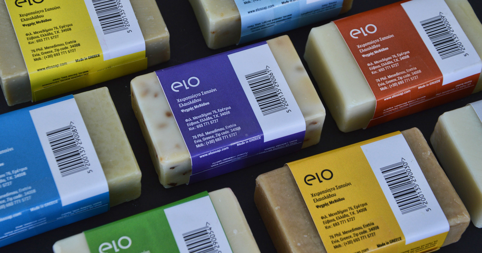
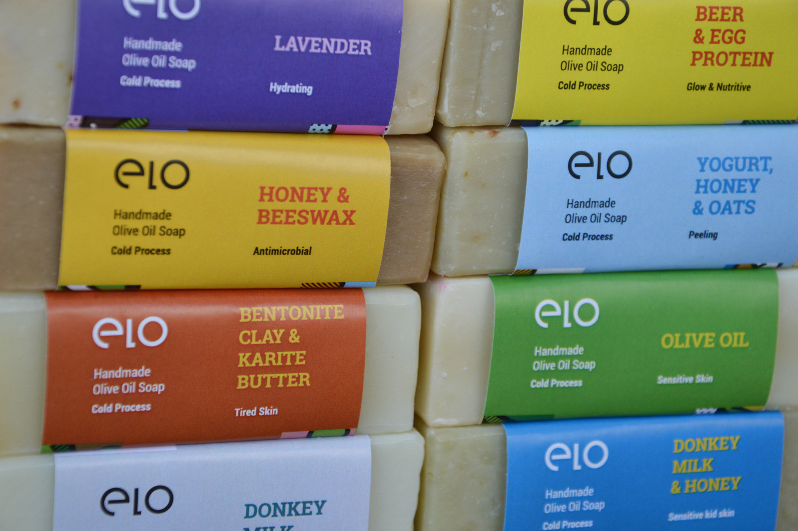
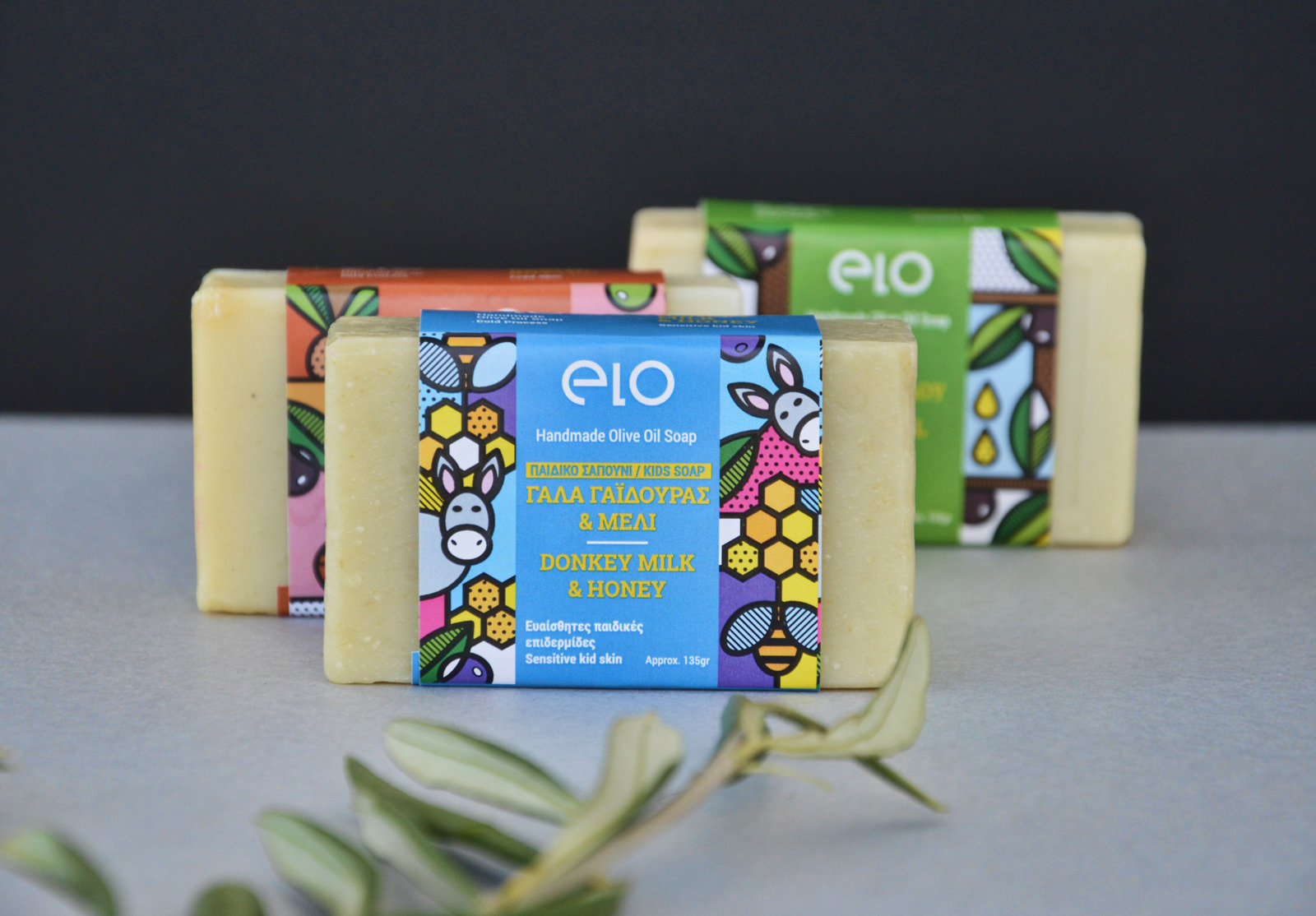
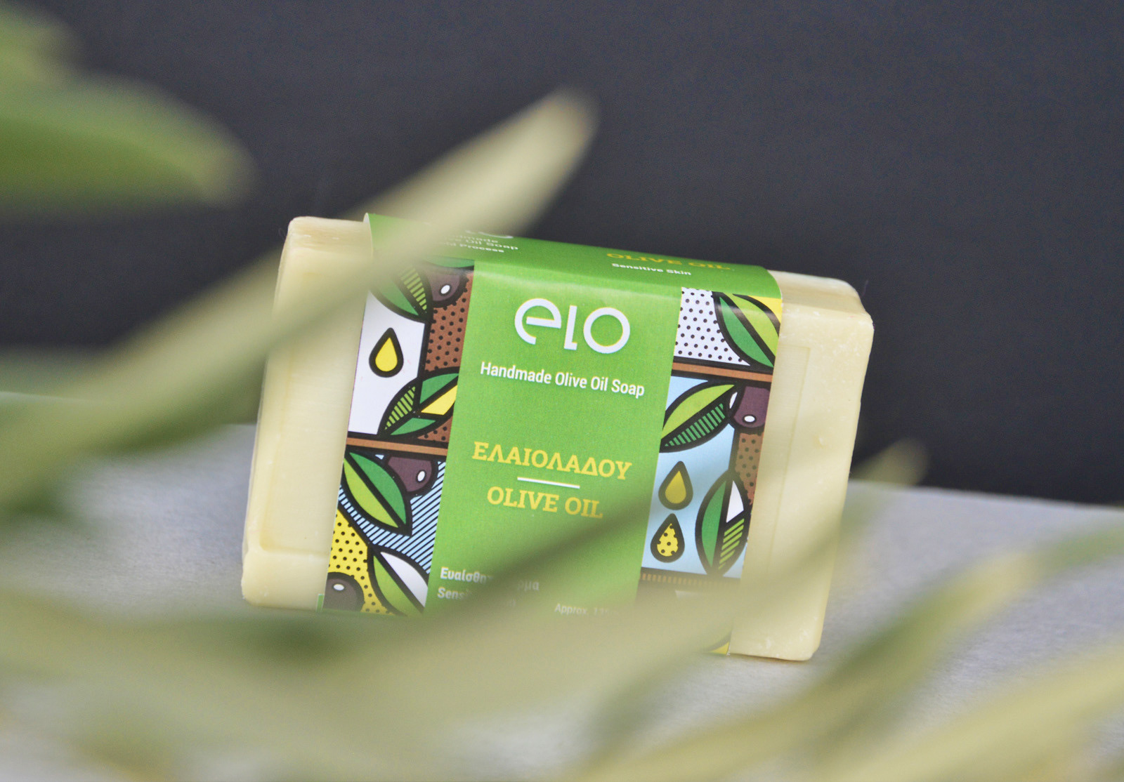
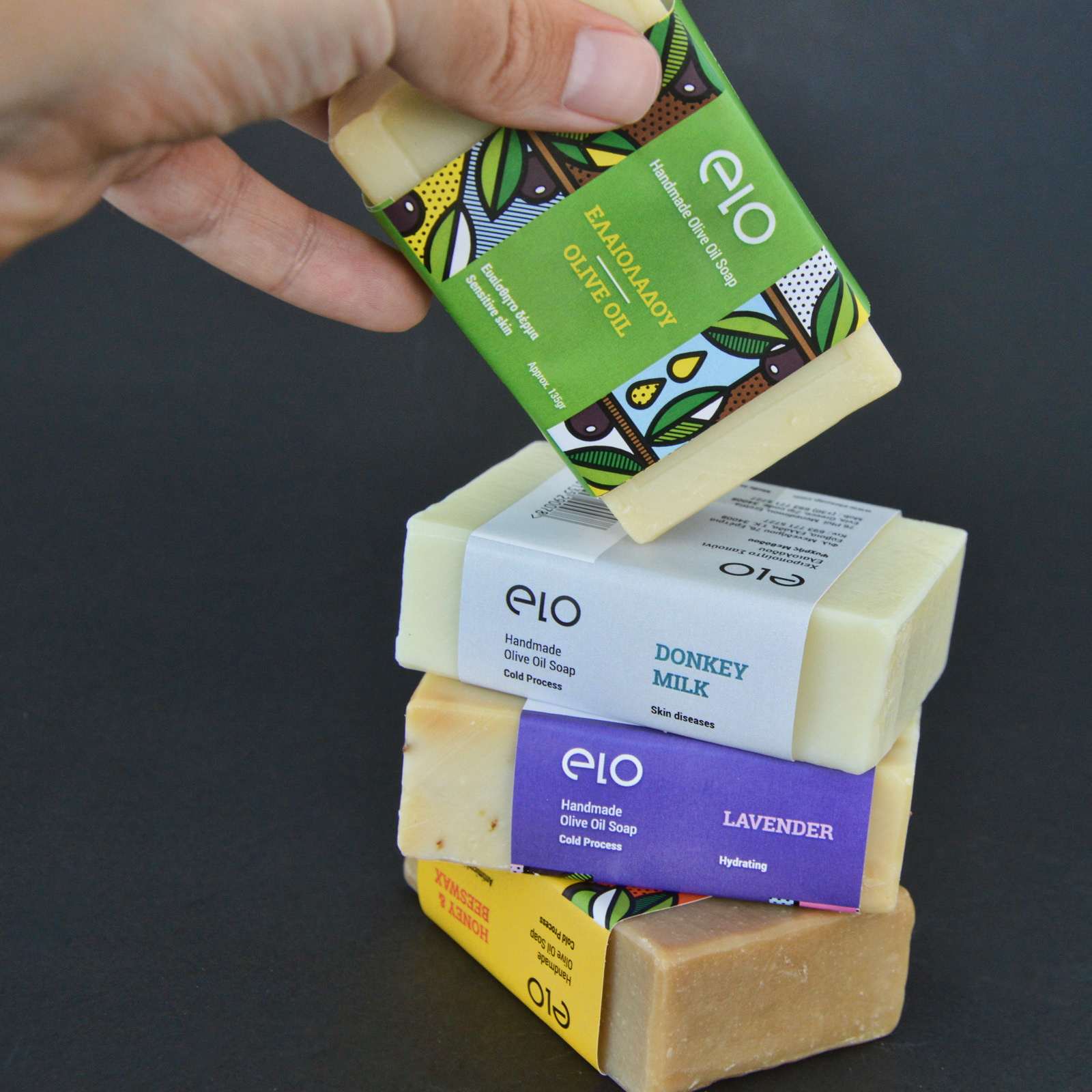
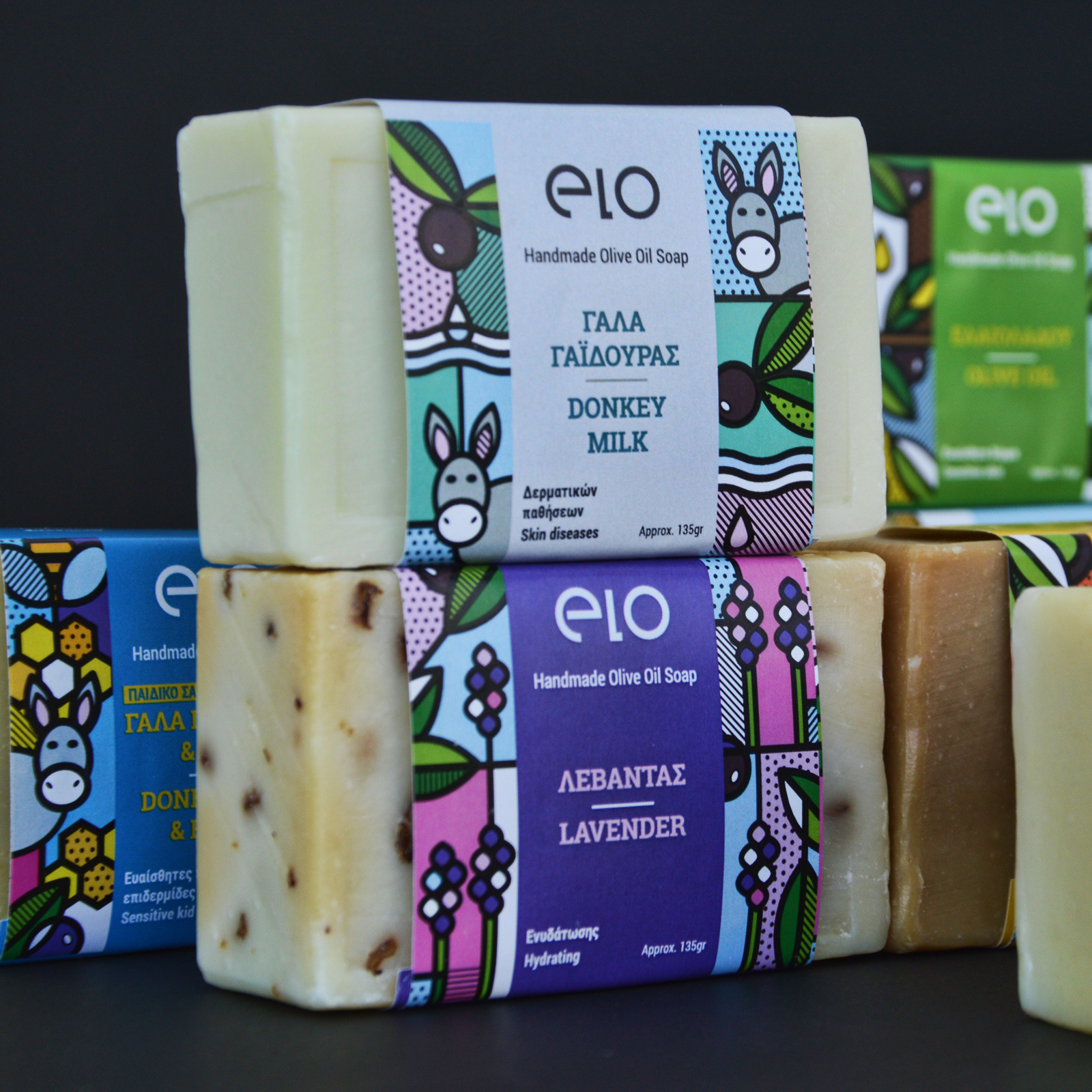
After making a special edition series of the Greek Gods for Elo Soaps, I was now commissioned to rebrand their main soaps and give them a new fresh eye catching look. Elo soaps are 100% natural handmade soaps made from pure Greek olive oil. My first task was to work on the logo, where we went for something clean, elegant and simple that would work well with the illustrations we had in mind to make for the packaging. The logo is handmade, made out of simple shapes and lines. Once the logo was ready it was time to refresh the packaging of the soaps. One of the instructions from the client was for the hanmade soap to be visible and not covered in whole by the packaging. That was also a challenge meaning I didn’t have much space to work on and fit all the information needed, logo and illustrations as the size of the soap is already small. Despite the challenge we managed to fit everything needed on all the soaps. Each illustration on each soap tells a different story based on the key ingredients of each soap and the colors used are also inspired by those ingredients. The style is as usual my pop art geometric style and a little abstract. Hope you enjoy the project.
