The client
Kona Tuna was founded in 2018 by enthusiastic fishermen who are passionate about marine life and preserving nature. Their passion and concern of the current ways of fishing and the high demand for tuna led them to establish their own company promoting sustainable fishing ways. Within one-year Kona Tuna gained respect and popularity within the Libyan community. It managed to seize a large market share in the local Libyan market which has one of the highest per capita consumption of canned tuna in the world. It is a sustainable tuna brand that relies on a fishing method called the pole and line. Although it is not the cheapest and there are not large quantities of fish available in this way, but this is the best way to preserve marine life, as no other innocent marine creatures are mistakenly caught, such as sharks, dolphins, and others.
The project
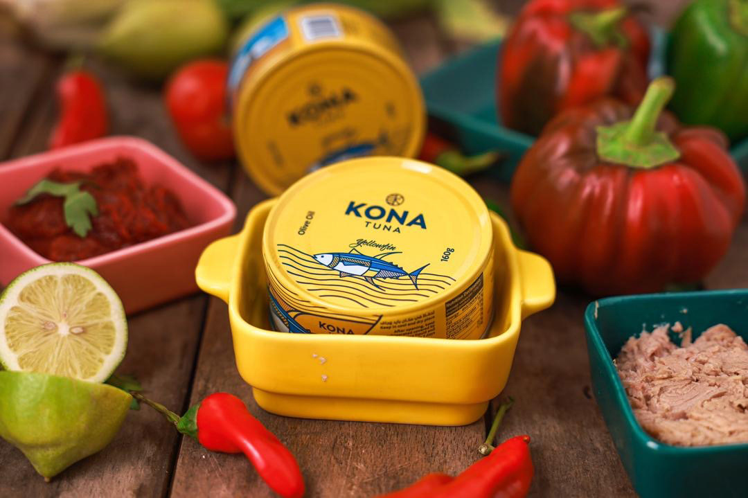
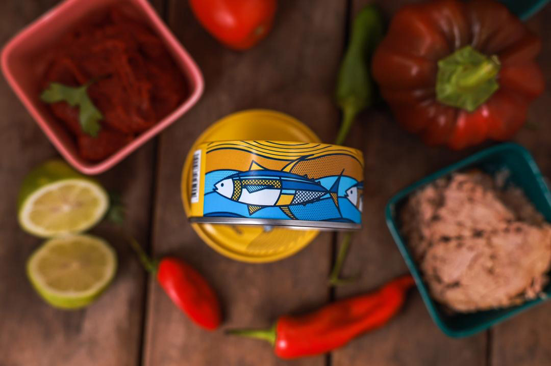
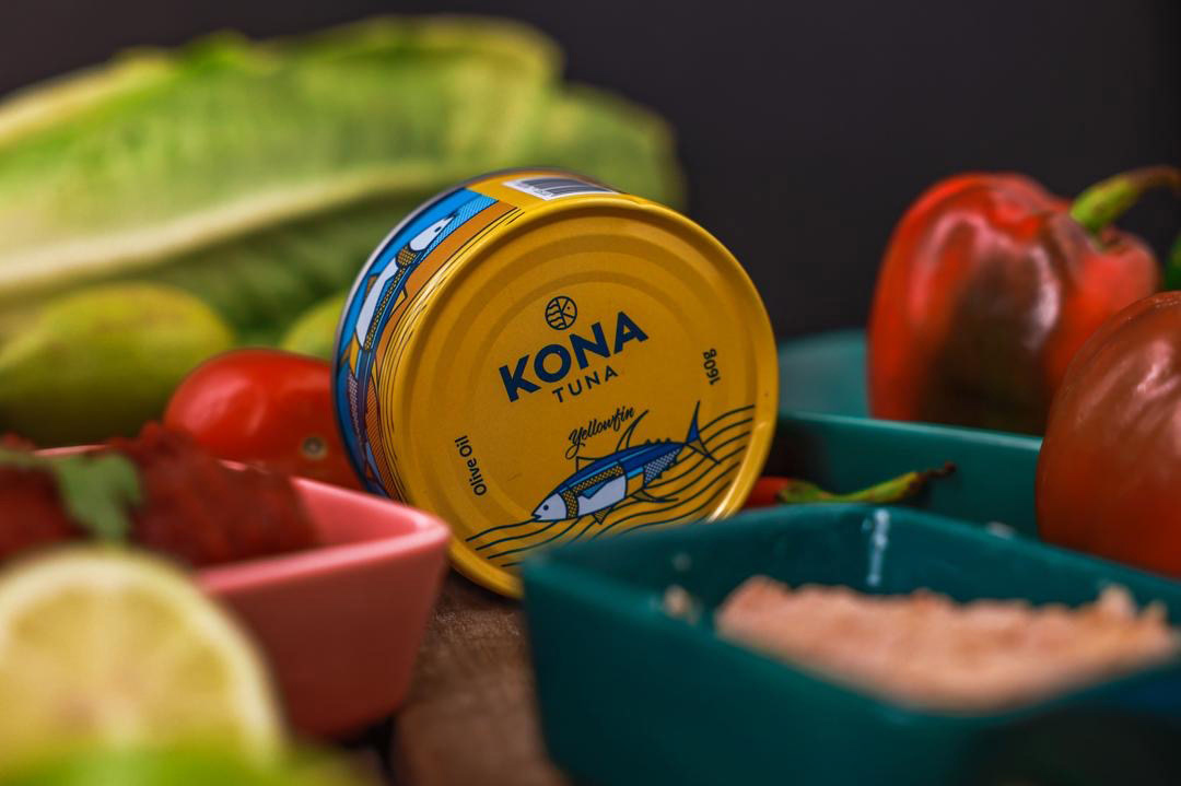
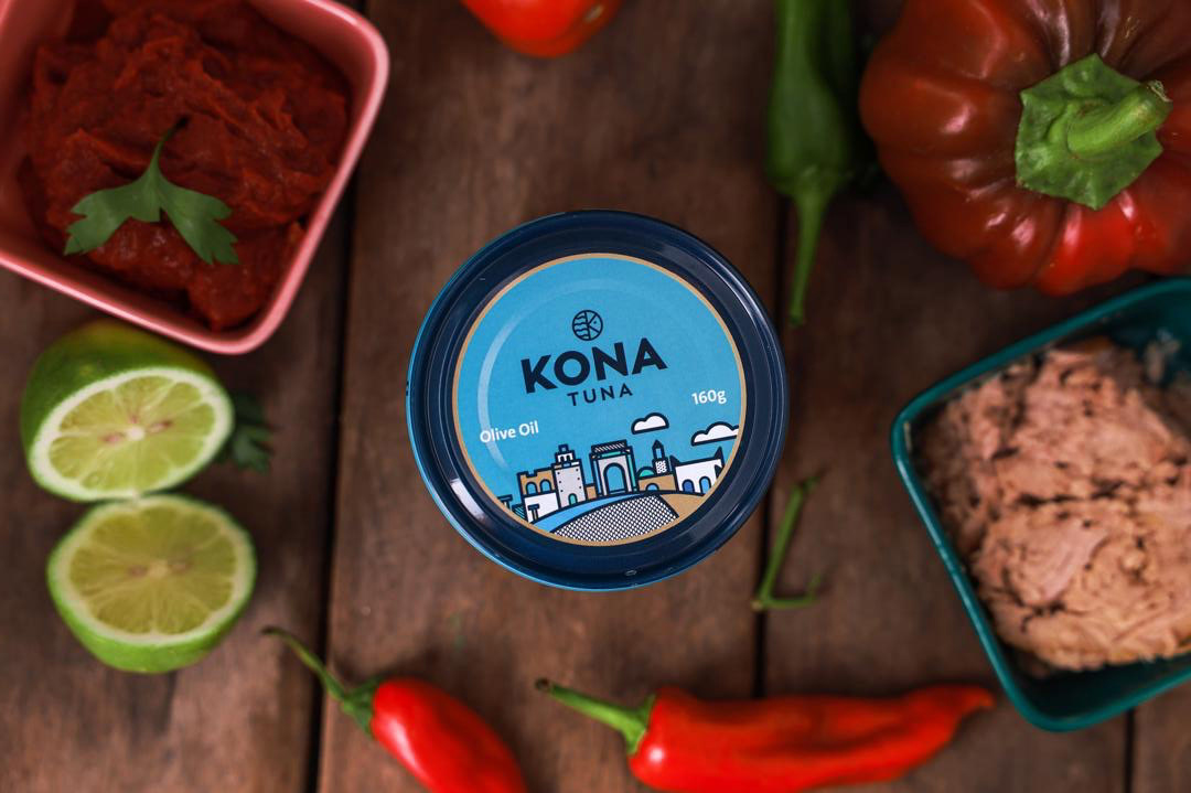
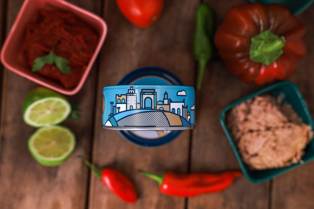
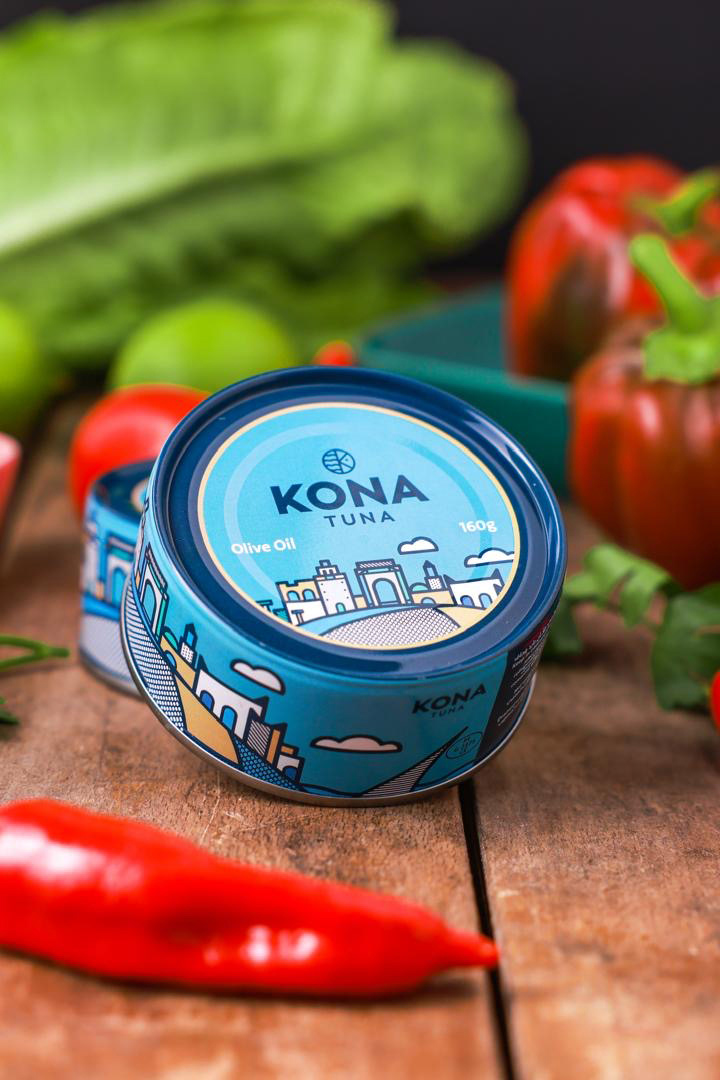
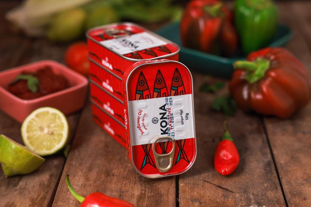
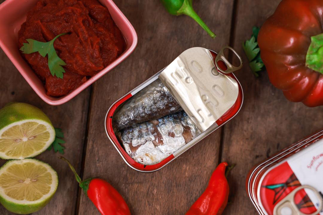
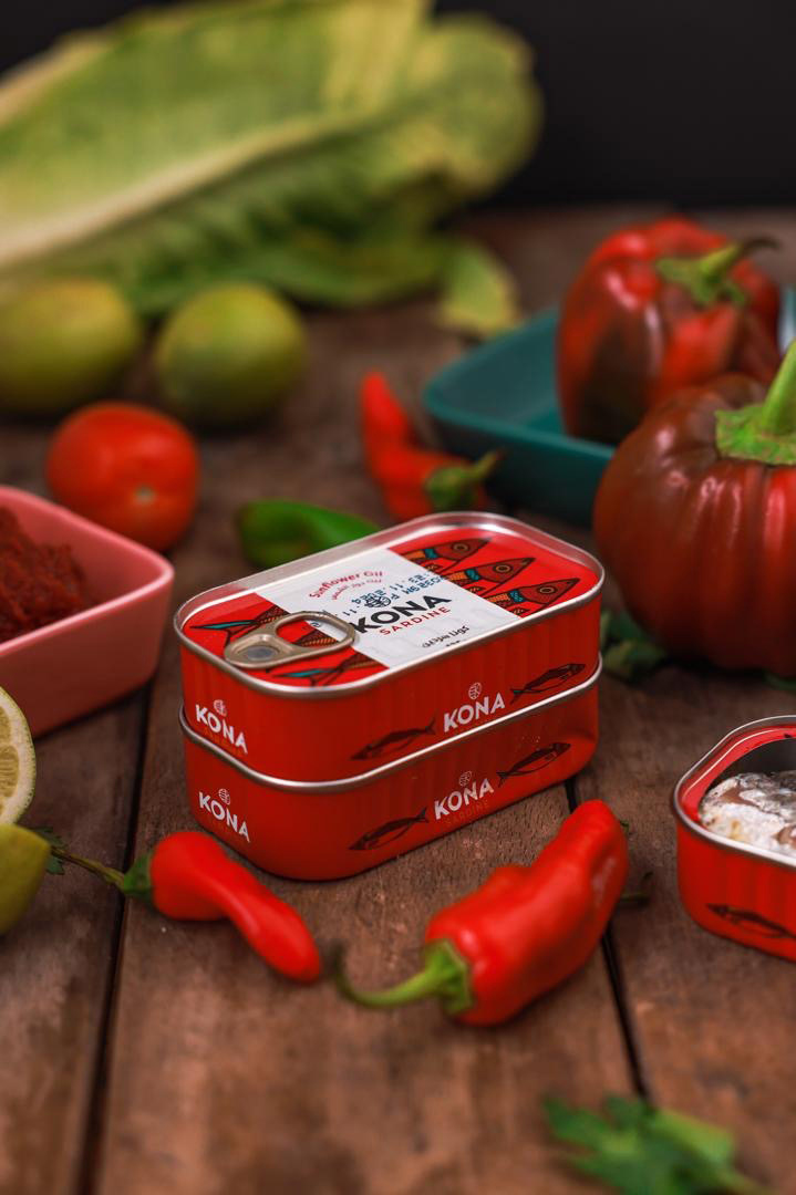
I was initially contacted by Kona Tuna to design their logo & package design. What started as a few designs lead to their whole branding identity. For the logo the goal was to make something unique, modern, bold and easy to recognize. The logomark is round like most of their cans and it consists of the sea, the letter "K" from Kona, and of course the head of a fish. The logotype is clean and bold. One of the main reasons they contacted me was for my illustrative signature style which was used to make some eye catching beautiful packaging designs that stand out. We started out with a limited edition can, then the Yellowfin tuna can and also made their sardine packaging. The branding and package designs are an ongoing project so this is just one of more presentations to follow in the future.
